Interactive Design | Exercises

23.04.2024 - 01.08.2024 / Week 1 - Week 15
Khu Ying Ying / 0357306
Interactive Design / GCD60904 / Bachelor of Design (Honours) in Creative Media
Exercises
TABLE OF CONTENTS
LECTURES
Week 1 (23/04/2024)
Introduction
Software Requirements:
- Adobe Dreamweaver
- Adobe Illustrator
- Adobe Photoshop
- Netlify
Project 1:
- This is a prototype of our own resume, do not make it too complicated. Sketches must be done in A4.
Project 2:
- A continuation of Project 1 (which is similar to Project 1).
Final Project:
- The topic can be anything but need to post the ideas (minimum 8 ideas) in Google Classroom before deciding on the final topic.
Week 1 (24/04/2024)
Usability: Designing Products for User Satisfaction
Notes from Google Slides:
Usability: Designing Products for User Satisfaction.
Meaning of Usability:
-
How effectively, efficiently, and successfully a user can utilize (用) a
product/design (user-friendly).
- The second level of user experience (UX) design.
- Depends on how well its features accommodate (给) users’ needs and contexts.
- Users can find their way about easily enough to achieve objectives without relying on expert knowledge.
- Guides users through the easiest route to achieve its goal.
Principles of Usability:
- Consistency:
- To ensure the website looks coherent (相干) and works harmoniously across all its different elements.
- e.g. Headers, footers, sidebars, and navigation bars.
- In a web design, it includes:
- e.g. Consistent navigation system, page layout and menu structure, fonts and typography, and branding.
- It will cause users frustration if similar-looking things don't produce a similar output.
- Examples of consistency in design:
- e.g. Apple.com, Sime Darby.com.my, and 153joombas.com.
- Simplicity:
- To minimize the number of steps involved in a process.
- To use symbols and terminology (术语) that make the interface as obvious as possible.
- To make it difficult to make mistakes.
- To help the users achieve their goals faster and more efficiently.
- Visibility:
- The more visible an element is, the more likely users will know about them and how to use them.
- Users should know, just by looking at an interface, what their options are and how to access them.
- Feedback:
- To communicate the results of any interaction.
- To give the user a signal that the product has succeeded/failed at performing a task.
- Error Prevention:
- To alert a user when they’re making an error.
Common Usability Pitfalls:
- Complex interfaces.
- Confusing navigation.
- Poor feedback.
- Inadequate (不适当) error handling.
Week 3 (07/05/2024)
Understanding Website Structure
Notes from Google Slides: Understand Website Structure.
Importance of Website Structure:
- A website structure affects:
- User experience (UX).
- Search engine option (SEO).
- Website performance.
- A well-structured website helps users:
- Find information easily.
- Keeps them engaged.
The Key Elements of a Well-Structured Website:
- Header:
- The top section of a webpage.
- Contains the website's logo, navigation menu, and contact information.
- Provides users with quick access to essential information and navigation.
- Body:
- The main content area of a webpage.
- Contains text, images, videos, and other multimedia elements.
- Proper organization of content is crucial for readability.
- Footer:
- Locates at the bottom of a webpage.
- Contains copyright information, links to important pages, and contact details.
- Provides closure to the webpage and additional navigation options.
- Organizing Content:
- Use headings (H1, H2, H3, etc.) to create a hierarchical structure.
- Logical grouping of content and clear labelling of sections improve UX.
- Navigation Menus:
- Help users move around the website.
- Use clear and concise (简洁) labels for menu items.
- Consider using dropdown menus for complex sites.
Week 4 (14/05/2024)
Web Standards
Figure L4.1: Lecture Notes - Web Standard, Week 4
(14/05/2024)
Week 5 (21/05/2024)
HTML & CSS
Figure L5.1: Lecture Notes - HTML & CSS, Week 5 (21/05/2024)
Week 7 (05/06/2024)
CSS Selector
Figure L7.1: Lecture Notes - CSS Selector
Week 9 (18/06/2024)
Box Model
Figure L9.1: Lecture Notes - Box Model
TUTORIALS
Week 2 (30/04/2024)
Prototype Design
We were assigned to a group (depending on where we were seated in class) to
design a new interface to solve a particular problem/meet a particular user
need based on the scenario given by the lecturer. My group got Scenario 1 as
we needed to design a new e-commerce app for a local clothing store.

Figure T2.1: Scenario 1, Week 2 (30/04/2024)
This was the final prototype design from my group.
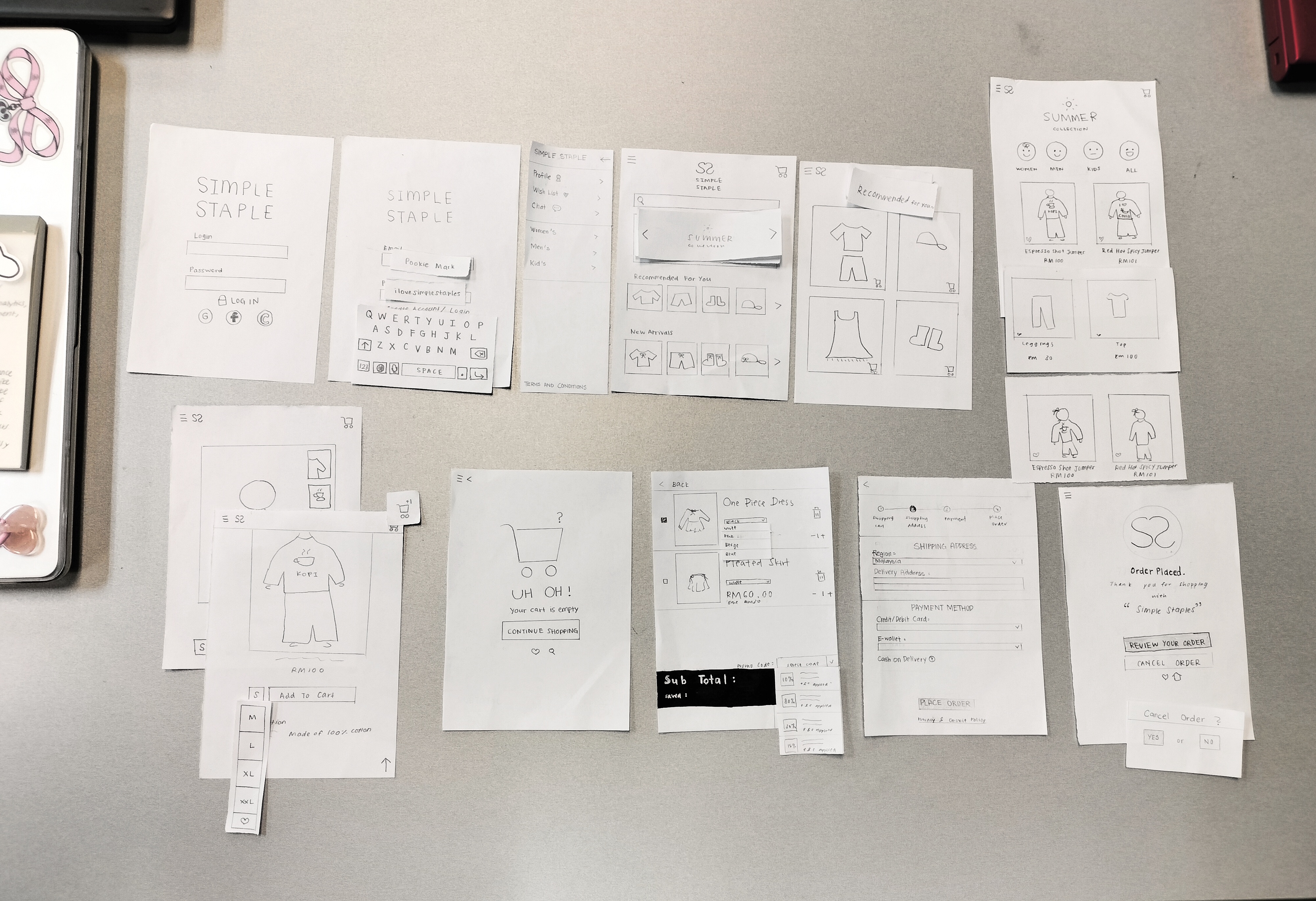
Figure T2.2: Final Prototype Design - Photo by Emily, Week 2
(30/04/2024)
INSTRUCTIONS
<iframe
src="https://drive.google.com/file/d/1XxZ4GlWre0iUTmrVDC7BdScj8GtVotBm/preview"
width="640" height="480" allow="autoplay"></iframe>
EXERCISE 1: WEB ANALYSIS
Week 1 (24/04/2024)
Requirements:
- Choose TWO (2) websites from the links given.
- Review the website that you've selected carefully, taking note of its design, layout, content, and functionality.
- Purpose and goals of the website, and evaluate whether they are effectively communicated to the user.
- Evaluate the visual design and layout of the website, including its use of color, typography, and imagery.
- Consider the functionality and usability of the website, including its navigation, forms, and interactive elements.
- Evaluate the quality and relevance of the website's content, including its accuracy, clarity, and organization.
- Consider the website's performance, including its load times, responsiveness, and compatibility with different devices and browsers.
- Identify the strengths and weaknesses of the website, and consider how they impact the user experience.
- Write a brief report summarizing in not less than 500 words.
Progress:
Website 1: Poison Studio
I choose Poison Studio from the
CSS Winner website
as the first web analysis.

Figure E1.1: Poison Studio,
Week 1 (24/04/2024)
Purpose and Goals:
Poison Studio
offers creative services to clients in the UK by highlighting project
portfolios, art branding, advertising, marketing, and others.
Visual Design and Layouts:
The
homepage has four sections, which are a Short Introduction section, a
Portfolio Showcases section, a Creative Lease section, and a Contact
section. For the background colours:
- Black and white colours for each section.
In my point of view, I think it is easier to understand the sections
on the homepage as they use two colours to differentiate each section.
This leads to a clear guide for users while scrolling the pages.

Figure E1.2: Homepage -
Sections & Colours, Week 1 (24/04/2024)
For typography, I think it is an acceptable balance between serif and sans-serif.
The typefaces do not appear to be too similar to one another but
consider limiting the typeface selection to ensure consistency
throughout the design, as too many typefaces might make the web seem
distracted and chaotic.
For example:
- Headings: Sans-serif, bold, and bigger size.
- Paragraphs: Serif, normal, and smaller size.

Figure E1.3: Typography, Week 1 (24/04/2024)
The imagery draws attention since it suits Poison
Studio's ideology of 'dare to be different'. They refused to be
ordinary because they wanted to highlight their client's brand in
everyone's eyes, thus the image they chose on their website is pretty
unusual and uncommon. For example (from the
Who We Are page):
- Digital collages to combine visual elements with a vintage setting:
- The vintage woman.
- The man in a vintage suit.
- A military man with his wife.
- Cash.
- Then, overlay some arrows and scribbling lines.
I think that's an outstanding method to convince the client since they
express their creativity through digital collage (imagery).

Figure E1.4: Imagery, Week 1 (24/04/2024)
Functionality and Usability:
The hamburger button in the upper right corner displays the
navigation (main menu). It's straightforward for me to
navigate the website because I can get anywhere in a few steps. On
the other hand, if the navigation is complicated, I would leave the
website right away since I would be frustrated trying to discover what I'm
looking for.

Figure E1.5: Navigation - Hamburger Button, Week 1 (24/04/2024)
They also included interactive elements on their website,
which I found pleasant and made me want to spend more time exploring it.
I've shown the differences in Figures E1.6 and E1.7. For example,
they change the cursor to a 'hand', which appears with varied hand signs
based on your current position. When the pointer lands on the heading, it
will be "highlighted" (e.g. circle, underlining, rectangle) or change
colour.
.jpg)
Figure E1.6: Interactive Elements, Week 1 (24/04/2024)
.jpg)
Figure E1.7: Interactive Elements, Week 1 (24/04/2024)
Quality and Relevance:
The
portfolio
features projects that relate to Poison Studio's
services, which results in accurate website content. The
portfolios displayed instances of graphic design work, such as brand
identification, website design and development, staff photographs, and
further examples.
.jpg)
Figure E1.8:
Portfolio -
Accuracy, Week 1 (24/04/2024)
However, considering the overall structure of the website, I think the
layout of the
portfolio page is a
little confusing. I believe the word "FEATURE" requires only one; it is
needless to double it. This is because the "Serif" font of "FEATURE" is
white in colour and bold, and it overlays the project portfolio. The
solution is to remove the "Serif" typefaces from "FEATURE" so that project
portfolios can be readily shown.

Figure E1.9: Portfolio
- Organisation, Week 1 (24/04/2024)
To be honest, I don't get the point of "I Want My Mommy" on the
Portfolio page; it links
you to the homepage, which I don't believe is relevant.

Figure E1.10: Portfolio
- Relevance, Week 1 (24/04/2024)
Performance on Different Devices:
I make use of three devices: a laptop, tablet, and smartphone. The
load time is short, yet it results in a more seamless user
experience on the page. However, the website adapts inconsistently to
different devices in terms of responsiveness. Figures E1.11, E1.12, and E1.13 illustrate the differences.

Figure E1.11: Responsiveness on Different Devices -
Homepage, Week 1
(24/04/2024)

Figure E1.12: Responsiveness on Different Devices - Navigation, Week
1 (24/04/2024)

Figure E1.13: Responsiveness on Different Devices -
Portfolios, Week
1 (24/04/2024)
Strength and Weakness:
- Strength:
- Includes interactive elements on the website to reduce bounce rate.
- Load time is short.
- Weakness:
- Complicated layout on the portfolio page.
- Inconsistent responsiveness on some devices.
Total Word Number: 611 words
Website 2: Fiteg² Protein Smoothies
I choose
Fiteg² Protein Smoothies
from the
CSS Winner website as the second web analysis.

Figure E1.14: Fiteg² Protein Smoothies, Week 1 (24/04/2024)
Purpose and Goals:
Fiteg² Protein Smoothies is a website that offers cage-free egg protein smoothies for
customers.
Visual Design and Layouts:
The
homepage
has six sections, which are a Short Introduction section, a Products
Display section, a Highlights section, a Ways to Use section, an About
Us section, and an All Rights Reserved section. For the
background colours:
- White colour for the main sections.
- Black colour for the About Us section.
- Yellow colour for the All Rights Reserved section.
However, the website managed to maintain consistency, resulting
in an organised and harmonious interface. This visual coherence is
readily apparent, showing the website's involvement in keeping
the design aesthetic. From my perspective, I can differentiate
the main sections on the website, which makes me focus more on them.
The other sections will be less focused as they use different colours
on them.
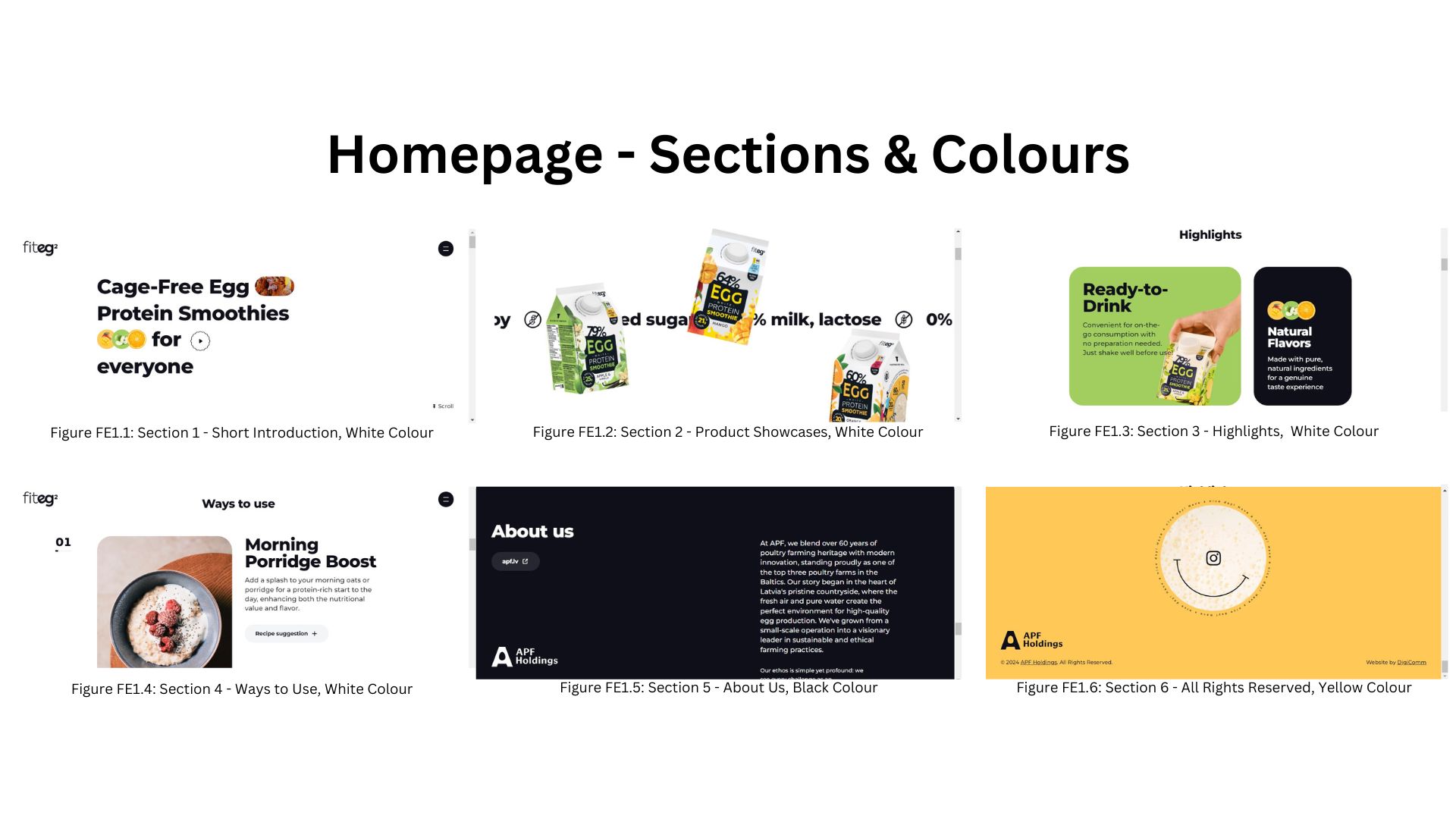
Figure E1.15: Homepage -
Sections & Colours, Week 1 (24/04/2024)
For typography, they use sans-serif
as the typeface and apply different fonts and sizes to differentiate
the headings, subheadings, and paragraphs. For example:
- Headings for the main sections: Used sans-serif, bold, and smaller sizes to emphasize the sub-categories.
- Subheadings on the Highlights section: Used sans-serif, bold, and bigger sizes to contrast with the headings.
- Paragraphs in the Highlights section: Used sans-serif, normal, and smaller sizes to balance with the subheadings.

Figure E1.16: Typography, Week 1 (24/04/2024)
As I observed, the imagery is relevant to their purpose.
The images chosen are closely associated with the contents in the
display section, ensuring clarity and interest in the audience.
Figures E1.17 and E1.18 elaborate on the imagery from the website.

Figure E1.17: Imagery, Week 1 (24/04/2024)
.jpg)
Figure E1.18: Imagery, Week 1 (24/04/2024)
Functionality and Usability:
The navigation (main menu) is in the
upper right corner that displays the hamburger button. It has a
multiple-language section for the audience to choose from: Latviski or
English. This will help enhance the brand's reach and awareness.
Besides that, it has an organised set of links for the homepage and
the three main protein smoothies of the brand, which are displayed as
imagery. To be frank, the navigation design is not only visually
appealing but also easy to understand, allowing for flawless
interaction with the website.

Figure E1.19: Navigation, Week 1 (24/04/2024)
The interactive elements are
quite interesting, when the cursor position is on the 'Play Button'
(Homepage - Short Introduction
section), the introduction will slightly change (e.g. words change,
images appear at the back, and the play button changes to a yellow
star). It conveys the information clearly and increases interactivity,
preventing users from remaining passive.

Figure E1.20: Interactive Elements, Week 1 (24/04/2024)
The other interactive elements are the 'Ways to Use' section (also in
the Homepage section). Figure
E1.21 elaborate on the interactive elements from the website.
.jpg)
Figure E1.21: Interactive Elements, Week 1 (24/04/2024)
Quality and Relevance:
After reviewing the website, I found that its contents, including
concepts, product descriptions, images, and more, are factual,
relevant, and well-presented. Additionally, the website is also extremely
well-organized, with easy navigation, a straightforward layout, and
standardised design features.

Figure E1.22: Organisation, Week 1 (24/04/2024)
Performance on Different Devices:
I utilise three devices: a laptop, a tablet, and a smartphone. The
load time is short, even it leads to a smoother user
experience on the page. While the layout and formatting were slightly
changed to match different screen sizes, these changes were minor and
had no major effect on the overall browsing experience, proving the
website's steady responsiveness across multiple devices. Figures
E1.23, E1.24, and E1.25 illustrate the differences.

Figure E1.23: Responsiveness on Different Devices -
Homepage, Week 1
(24/04/2024)

Figure E1.24: Responsiveness on Different Devices - Navigation,
Week 1 (24/04/2024)

Figure E1.25: Responsiveness on Different Devices - Product
Showcases, Week 1 (24/04/2024)
Strength and Weakness:
- Strength:
- Visual appealing and good navigation.
- Has steady responsiveness across multiple devices.
- Load time is short.
- Weakness:
- So far, it appears to have no weaknesses.
Total Word Number: 560 words
EXERCISE 2: WEB REPLICATION
Week 3 (07/05/2024)
Requirements:
- Choose any two from the links given.
- https://www.morganstanley.com/
- https://banditrunning.com/
- https://www.oceanhealthindex.org/?authuser=0
- Replicate TWO (2) existing main pages of the websites given in the link below to gain a better understanding of their structure.
- You are allowed to use Adobe Photoshop/Adobe Illustrator for this exercise.
- You can use any image from the stock image/free stock icon. The image that you will be using does not have to be an exact image from the original website. You may replace it with a similar image.
- Focus on the layout, type style, and colour style. To find similar typefaces/fonts, you can download fonts from Google Fonts.
- You may need to screengrab the website and can begin to replicate the page.
Submissions:
- Show differences between the original and the replication.
Progress:
Website 1: Bandit Running
To screengrab:
- Right-click > click Inspect > click the menu button (3 dots) > click 'Run command' (Ctrl + Shift + P) > type/choose 'Capture full size screenshot" > click 'Screenshot'.
- **Make sure the dimension is 1300 (width) because it can capture the navigation**
To fit the screengrab sizes in AI for the artboard:
- Manually: Shift + O > drag the artboard to fit the screengrab.
- Automatically: Object > Artboard > Fit to Selected Art.
To insert a special character:
- Type > insert special character.
Screengrab:
Bandit Running's
main page.

Figure E2.1:
Bandit Running
Main Page Screengrab, Week 3 (07/05/2024)
Adobe Illustrator:
Use guidelines to trace the contents.

Figure E2.2: Guidelines, Week 3 (07/05/2024)
Univers LT Std as the typeface.

Figure E2.3: Typeface, Week 3 (07/05/2024)
Create the graphic elements such as logo, search tool
icon, and arrow.

Figure E2.4: Graphic Elements, Week 3
(07/05/2024)
Adobe Photoshop:
Photos are from the
Freepik website.

Figure E2.5: Photos, Week 3 (07/05/2024)
Comparisons:
.jpg)
Figure E2.6: Comparisons between Original &
Replication, Week 3 (07/05/2024)
.jpg)
Figure E2.7: Comparisons between Original &
Replication, Week 3 (07/05/2024)
Final Submission of Web Replication 1 - Bandit Running.
Figure E2.8: Final Submission of Web Replication 1 - Bandit Running
in PDF, Week 3 (07/05/2024)
Website 2: Ocean Health Index
Screengrab:
Ocean Health Index's
main page.

Figure E2.9:
Ocean Health Index
Main Page, Week 3 (07/05/2024)
Adobe Illustrator:
Use guidelines to trace the contents.


Figure E2.10: Guidelines, Week 3 (07/05/2024)
Source Sans Variable as the typeface.

Figure E2.11: Typeface, Week 3 (07/05/2024)
Photos from the Freepik website and screengrab of
Ocean Health Index's
website.

Figure E2.12: Photos, Week 3 (07/05/2024)
Comparisons:
.jpg)
Figure E2.13: Comparisons between Original & Replication,
Week 3 (07/05/2024)
.jpg)
Figure E2.14: Comparisons between Original & Replication,
Week 3 (07/05/2024)
.jpg)
Figure E2.15: Comparisons between Original & Replication,
Week 3 (07/05/2024)
Final Submission of Web Replication 2 - Ocean Health Index.
Figure E2.16: Final Submission of Web Replication 2 - Ocean Health Index
in PDF, Week 3 (07/05/2024)
EXERCISE 3: CREATE A RECIPE CARD
Week 15 (31/07/2024)
Requirements:
- Create a recipe card from the link below.
- Create an HTML file named "index.html."
- Recipe title.
- Include necessary images for the page.
- List of ingredients.
- Step-by-step cooking instructions.
- Create an external CSS file named "style.css."
- Apply CSS rules to style your recipe card.
- Use CSS selectors such as element selectors (e.g., body, h1, ul), class selectors (e.g., .recipe-title, .ingredient-list), and ID selectors (e.g., #instructions) to style different parts of the card.
Submissions:
- Upload the recipe book HTML file to Netlify, and add the link to your e-portfolio.
Progress:
HTML & CSS
I selected "A Simple Tomato Soup Recipe" for my recipe card's choice and listed the content in the
Google Doc, including the recipe title, ingredients, instructions,
and images.
Figure E3.1: Content, Week 15 (31/07/2024)
Then, I started to put the content and separated them according to
their sections.

Figure E3.2: HTML & CSS, Week 15 (31/07/2024)

Figure E3.3: HTML & CSS, Week 15 (31/07/2024)
Final Submission of Exercise 3.
Tomato Soup Recipe: Link

Figure E3.4: Final Submission of Exercise 3 - Webpage Screengrab, Week 15 (31/07/2024)
REFLECTIONS
Experience
Notes
QUICK LINKS
Projects


Comments
Post a Comment