Major Project 1 | Task 3: Concept Presentation

05.03.2025 - 21.03.2025 / Week 5 - Week 7
Khu Ying Ying / 0357306
Major Project I / PRJ64904 / Bachelor of Design (Honours) in Creative Media
Task 3: Concept Presentation
TABLE OF CONTENTS
INSTRUCTIONS
<iframe
src="https://drive.google.com/file/d/1bP-wKHN3fBiayG_bfl3l5aMTwtJBK_FM/preview"
width="640" height="480" allow="autoplay"></iframe>
TASK 3: CONCEPT PRESENTATION
Week 5 (05/03/2025)
Requirements:
- Carry on from Task 2 Design Propositon and continue to develop the final proposal with a comprehensive concept presentation.
- Follow the outline/framework that is provided in the Proposal Brief for the presentation:
- 1) Slide Title Card:
- Project Title
- Your Name(s) and Student ID
- BDCM (Graphic Design)
- Supervisor(s)
- Date of presentation
- 2) Introduction:
- Overview & Context
- Problem Statement
- 3) Project Objectives:
- Project Goals
- Scope & Deliverables
- 4) Audience Research:
- Target Audience
- Problem Identification
- 5) Existing Media Analysis:
- Benchmarking Existing Media
- Key Differentiators
- 6) Ideation, Concept Development, and Information Design:
- Initial Design Concepts
- Concept Selection
- 7) Development Planning and Schedule:
- Gantt Chart Planning
- Checkpoints
Submissions:
- All information must be presented in PDF slide format and accompanied by physical mockups.
Progress:
Task Allocation
After our Task 2: Design Proposition, we divided the tasks among ourselves. Aisya and Lizzie took charge of
branding, including designing the logo, book cover, and packaging, while
Sheryne and I focused on creating the card illustrations.
Card Illustrations:
Based on Sheryne's Malin Kundang design, I drew my version to see if it
would work, including characters like Malin Kundang, his mother, and his
wife. To be honest, the outcome wasn’t quite what I expected
(like, why is the sketch on paper always better than digital,
omg).

Figure T3.1: Sheryne's Malin Kundang (Initial), Week 6
(10/03/2025)

Figure T3.2: My Malin Kundang (Initial), Week 6 (10/03/2025)
As Sheryne focused on designing the card border, I shifted my attention to
the merchandise since I wasn’t quite getting the right feel at that time.
I ended up creating a sticker set for Malin Kundang, with elements
inspired by Sumatra and the folklore itself:
- Wave symbolizing the location of Malin Kundang’s story.
- Features Sumatra’s batik motif (Simbut).
- A stamp representing Indonesia’s national flower, bunga melati (jasmine).
- Some humorous meme-style designs to add a playful touch to the characters.

Figure T3.3: Stickers, Week 6 (11/03/2025)
Week 6 Tutorial Session (12/03/2025):
When we presented our logo variations and printed items to Ms. V and Ms.
Anis, they provided the following feedback:
- Logo Variations:
- Use a serif font for the brand name and a sans serif font for the strapline.
- Manual Book:
- Make the strokes on the book cover thinner and avoid overusing curved elements.
- Apply curved elements on the pages to introduce each region.
- Reduce the amount of white space.
- Ensure layout consistency throughout the book.
- Character Cards:
- Make the characters more dynamic by incorporating varied perspectives to enhance the player experience.
- Integrate design elements from the Gunungan logo into the card design.
Week 6 Meeting (13/03/2025):
We then met up at X-Space again to refine our work based on the feedback
from the lecturers. I started by organising the art guide Canva slides
(Sumatra edition) and adding photo references for each example provided by
Sheryne. This helped provide clearer visual ideas for the card
illustrations, as I was planning to focus on illustrating characters from
Sumatra's folklore.
Figure T3.4: Art Guide (Sumatra Edition), Week 6 (13/03/2025)
At the same time, Sheryne worked on the regional motifs by identifying
common characteristics from each region and simplifying them while
maintaining their distinctive elements.

Figure T3.5: Regions' Motifs, Week 6 (13/03/2025)
Characters Illustrations:
After I finished adding the photo references to the Art Guide, I started
illustrating the characters from Danau Toba’s folklore, including Toba,
the son, and the princess. To be honest, I didn’t have a clear idea for
their poses/gestures, so I searched for references on Pinterest, traced
the base poses, and then added the clothing and facial features to
complete the designs.

Figure T3.6: Danau Toba - Toba Illustration, Week 7 (17/03/2025)

Figure T3.7: Danau Toba - The Princess Illustration, Week 7
(17/03/2025)

Figure T3.8: Danau Toba - The Son Illustration, Week 7
(17/03/2025)
For the background, I selected Danau Toba's scenery to complement
the characters, as it directly relates to the folklore's
setting.

Figure T3.9: Danau Toba - Scenery Illustration, Week 7
(17/03/2025)
And these were the character illustrations, complete with the Danau
Toba background.

Figure T3.10: Danau Toba - Characters Illustration with
Background, Week 7 (17/03/2025)
Card Border Design:
For the card border, we primarily focused on Sumatra and Java, with
Aisya tracing the motif patterns and the card border designed by
Sheryne.

Figure T3.11: Motif and Border Design - Sumatra, Week 7
(17/03/2025)
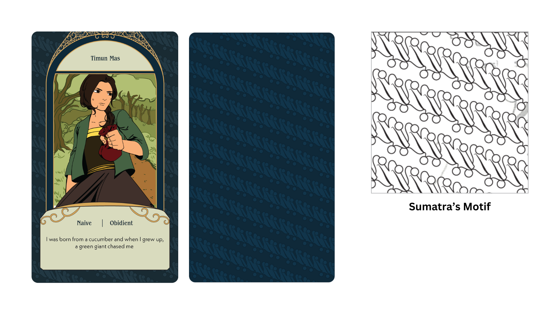
Figure T3.12: Motif and Border Design - Java, Week 7
(17/03/2025)
Here are the character designs and card designs.

Figure T3.13: Character Designs, Week 7 (17/03/2025)

Week 7 (18/03/2025)
Finalise Everything
Printing:
Lizzie sent the printing details and divided the costs in our
group chat. We all reviewed the information, agreed on the
pricing, and confirmed our contributions without issues.

Figure T3.15: Printing Details & Costs, Week 7
(18/03/2025)
Here are the final results of our printed items.

Figure T3.16: Printed Items, Week 7 (18/03/2025)
Figure T3.17: Booklet Flip Through (MP4), Week 7 (19/03/2025)
Presentation & Feedback:
We changed our presentation slides from vintage brown to dark blue
to align with our brand's theme. We also divided the slides among
ourselves, assigned presentation parts, and revised them again to
ensure we were familiar with our sections.

Figure T3.17: Changing Slide's Theme, Week 7 (18/03/2025)
The next day, we presented our progress in class, and Ms. V provided us
with some feedback:
- Illustration Consistency: Ensure uniformity in the illustrations, including the art style, colour scheme, character proportions, and placement on the cards, as some characters appeared with varying sizes and proportions.
- Presentation Focus: The flow of the presentation was solid, but we were advised to focus more on explaining the game mechanics rather than presenting too much data.
- Design Elements: Maintain consistency in the character design, paying attention to details like shading, face shape, character height, line art, and color palette.
- Positive Feedback on Branding: The logo, packaging, and layout designs were well-received. However, we were reminded to ensure greater consistency in the use of ornaments across all design assets for a cohesive look.
Week 7 (19/03/2025)
Concept Presentation
Figure T3.18: Final Submission of Task 3 - Concept Presentation (PDF),
Week 7 (19/03/2025)
FEEDBACKS
Week 6 (12/03/2025)
Specific Feedback: Ms. V and Ms. Anis recommended using a serif
font for the brand name and a sans serif font for the strapline in the logo
variations. For the manual book, they suggested thinner strokes on the
cover, fewer curved elements, and applying curves on the pages to introduce
each region. They also advised reducing white space and ensuring layout
consistency. For the character cards, they encouraged making the characters
more dynamic with varied perspectives and integrating elements from the
Gunungan logo into the design.
General Feedback: Present your proposal both digitally and as a
mock-up.
Week 7 (19/03/2025)
Specific Feedback: Ms. V suggested ensuring
consistency in illustration style, colour scheme, character proportions,
and placement. She also advised focusing more on explaining the game
mechanics during the presentation and maintaining uniformity in character
design elements like shading, face shape, and line art. Lastly, she noted
that while the logo, packaging, and layout were well done, the use of
ornaments across assets could be more consistent.
General Feedback: Complete the e-portfolio by Friday at
11:59 PM.
REFLECTIONS
Experience
I thought a short semester would be a piece of cake like Semester 1.5, but
this module really burned my brain and health for real. I truly appreciate
my group members, Aisya, Lizzie, and Sheryne—without them, I don’t think I
could have reached this point. We worked hard together, from refining our
designs and illustrations to revising our slides and game mechanics based on
the feedback we received. I also want to thank Ms. Anis and Ms. V for their
continuous guidance and advice during consultations and online chats, which
helped us improve and stay on track. This semester was intense, but I’ve
learned so much, and despite the challenges, I’m proud of what we achieved
as a team.
Observation
Although I always say consistency is key, achieving it in real life is harder,
especially since Sheryne and I have different art styles. I realised we should
communicate more and align our approaches early on to avoid inconsistencies.
This project taught me the value of teamwork, clear communication, and staying
unified despite creative differences.
Findings
I learned that I should carefully consider the theme of the project and
choose character poses more thoughtfully next time to ensure they reflect
the story and fit the overall design. This will help create stronger visual
consistency and better storytelling through the illustrations.
QUICK LINKS


Comments
Post a Comment